Turning Wild Energy Into Shelf Impact
Design
How dec6 Reimagined Wild T’s Packaging; Creating A Bold, Expressive System That Translates Brand Attitude Into Cans And Multi-pack Boxes Built To Stand Out On Shelf.
Turning Wild Energy Into Shelf Impact
Wild T entered the market with a strong product idea; but its visual identity lacked clarity and consistency.
The original packaging:
- Didn’t fully express the brand’s bold personality
- Felt visually fragmented across formats
- Lacked a clear system that could scale beyond a single SKU
Wild T needed packaging that could speak loudly, clearly, and confidently; especially in a crowded alcoholic beverage category.

This wasn’t just a redesign; it was a translation problem.
Wild T is:
- Bold
- Playful
- Slightly rebellious
- Rooted in its Ohio origins
But none of that was coming through consistently.
Our insight was simple:
If Wild T is loud in personality, the packaging has to be loud in presence; without becoming messy.
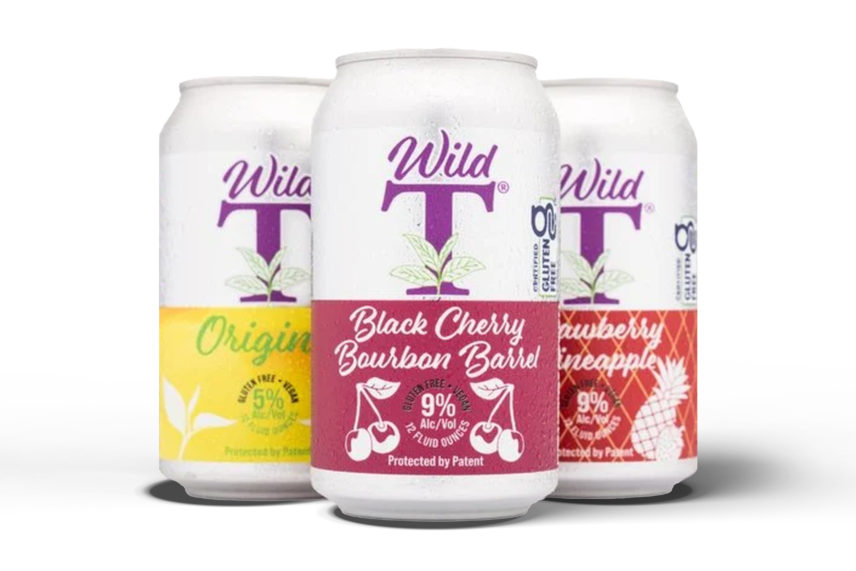
We built the new packaging system around three core ideas:
- Bold Recognition: Large logo presence and strong contrast
- Flavor Clarity: Each variant instantly recognizable
- System Thinking: One design language, adaptable across cans and boxes
We took inspiration from:
- Wild T’s energetic brand tone
- Real ingredients and flavor cues
- The brand’s Ohio roots; expressed subtly through natural elements and structure
The result: a system that feels wild; but intentional.
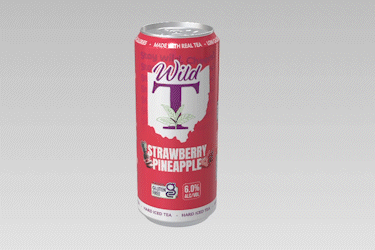
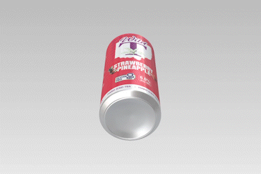
The can became the hero canvas.
Key design decisions:
- A strong central logo that anchors the design
- Bold background colors for high shelf visibility
- Natural ingredient illustrations to reinforce flavor authenticity
- Clear hierarchy for alcohol content, flavor, and product type
The can needed to work both up close in hand and from six feet away on shelf; and it does.
- Visual elements lacked cohesion
- Branding didn’t translate well across formats
- Shelf impact was limited
The product existed; but it didn’t command attention.
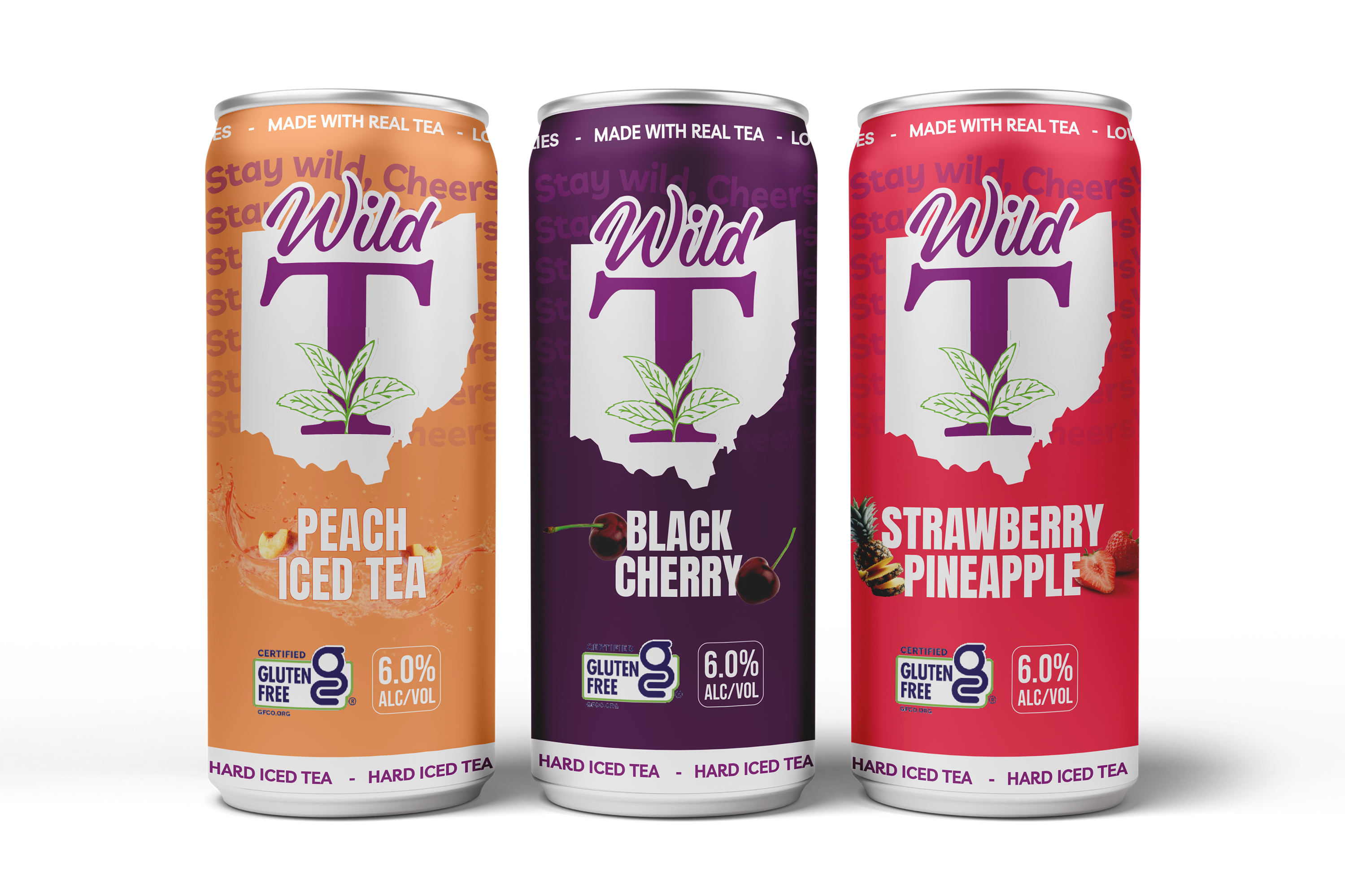
- A strong, unified visual language
- Immediate brand recognition
- Clear differentiation between flavors
- Packaging that feels confident and fun
The new design doesn’t whisper; it announces itself.
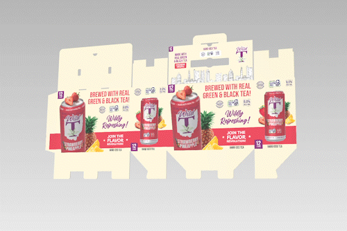
The challenge wasn’t just the can; it was extending the design to multi-pack boxes without losing impact.
We designed the party pack to:
- Carry the same bold energy as the can
- Clearly showcase included flavors
- Work in both physical retail and promotional imagery
The result is a box that feels like a celebration, not just packaging.
Wild T now has a packaging system built for growth.
What changed:
- A confident, expressive visual identity
- A scalable system across cans and boxes
- Strong shelf presence in a competitive category
- Packaging that finally matches the brand’s energy
This wasn’t just a visual refresh; it was a brand coming into its own.