Building a Modern Brand for a Legacy Manufacturer
Design
How dec6 Transformed Premier’s Identity; From Logo To Full Visual System; Creating A Scalable, Future-ready Brand Built On Trust, Durability, And Modern Design Thinking.
Building a Modern Brand for a Legacy Manufacturer
Premier is a plywood and laminate manufacturer established in 1993, with a strong footprint across Andhra Pradesh and surrounding regions. Over the years, the brand built credibility through consistent quality and affordability; but its visual identity no longer reflected its scale, ambition, or maturity.
As the market evolved and competition intensified, Premier needed a brand that could stand shoulder to shoulder with national players, while continuing to earn the trust of contractors, dealers, and end customers.
dec6 was brought in to reimagine Premier’s brand from the ground up; without erasing the legacy it had worked decades to build.
The challenge wasn’t about making Premier “look premium.”
It was about making Premier look credible, confident, and future-ready.
Key problems we identified:
- An identity that lacked authority and consistency
- No clear visual system to scale across products and touchpoints
- A disconnect between product quality and brand perception
In a category where trust is everything, even small inconsistencies can weaken confidence.
Our core insight was simple but critical:
Premier isn’t just selling plywood; it’s selling reliability to builders and peace of mind to homeowners.
This meant the brand needed to balance:
- Strength without aggression
- Modernity without trend-chasing
- Affordability without feeling cheap
Every branding decision moving forward had to reinforce this balance.

Before designing anything, we defined a clear brand foundation:
- Purpose: Making durable, high-quality materials accessible across India
- Positioning: A trusted partner for long-lasting construction
- Personality: Reliable, confident, grounded, modern
- Tone: Professional, warm, clear, jargon-free
This foundation ensured the identity wasn’t just visually appealing; but strategically aligned with Premier’s business goals.

The earlier identity served its purpose but lacked:
- Distinctiveness
- Symbolic meaning
- Visual authority
It didn’t communicate leadership or scale; and struggled to stand out in a crowded market.
The new Premier logo was designed to project trust and leadership.
Key elements:
- Shield: Protection, reliability, long-term strength
- Horse: Endurance, power, consistency
- Crown: Quiet confidence and industry leadership
The logo system was built for longevity; designed to remain effective across decades, not just campaigns. Clear spacing, size, and misuse rules ensure the identity is never diluted, regardless of application.
The visual language was crafted to feel premium yet grounded.
Color System
- Dark Sapphire: Stability, trust, professionalism
- Goldenrod: Craft, pride, value
Typography
- Fahkwang: Modern, confident headline type
- Outfit: Clean, highly readable body type
Together, these elements create a system that feels authoritative without intimidation.
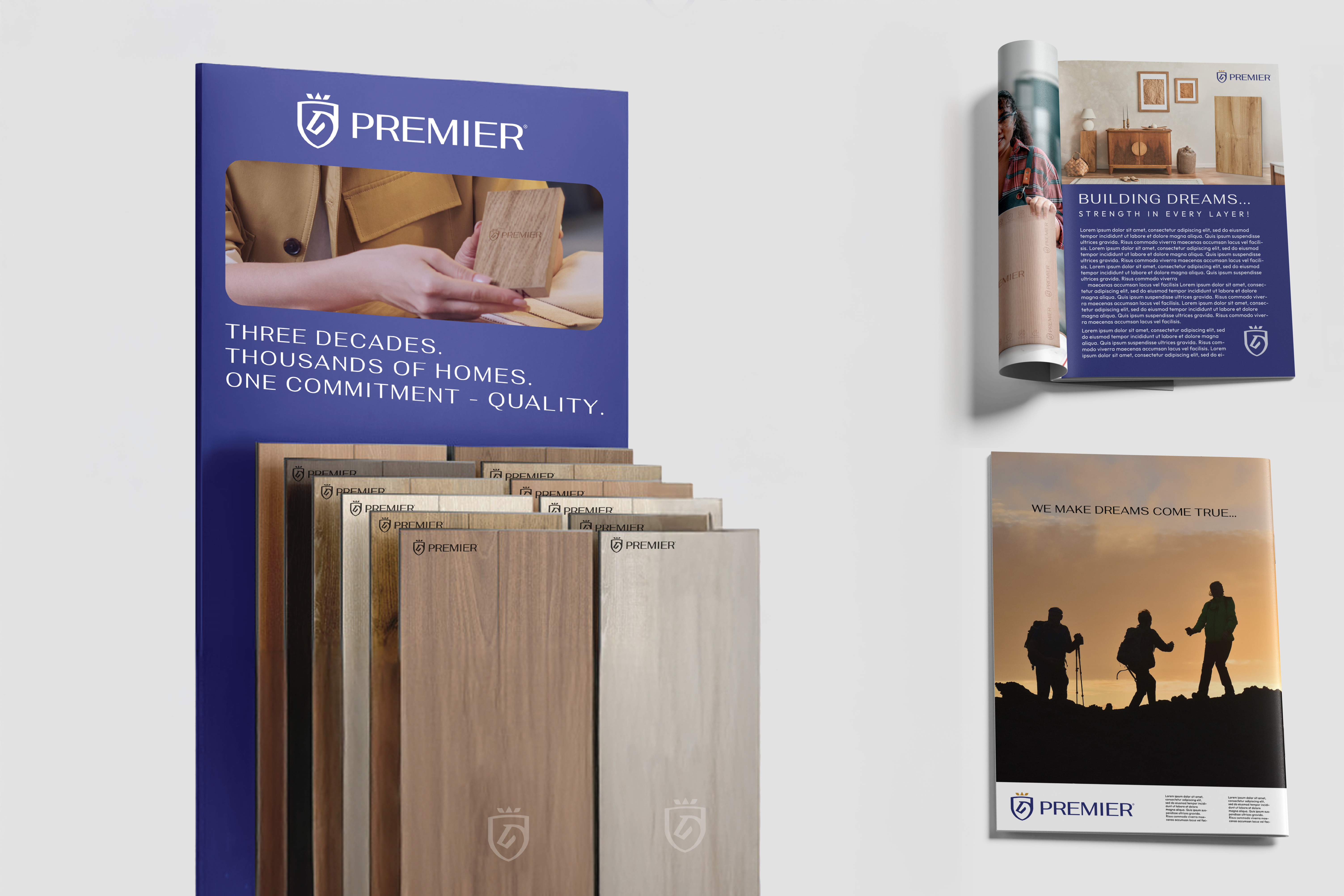
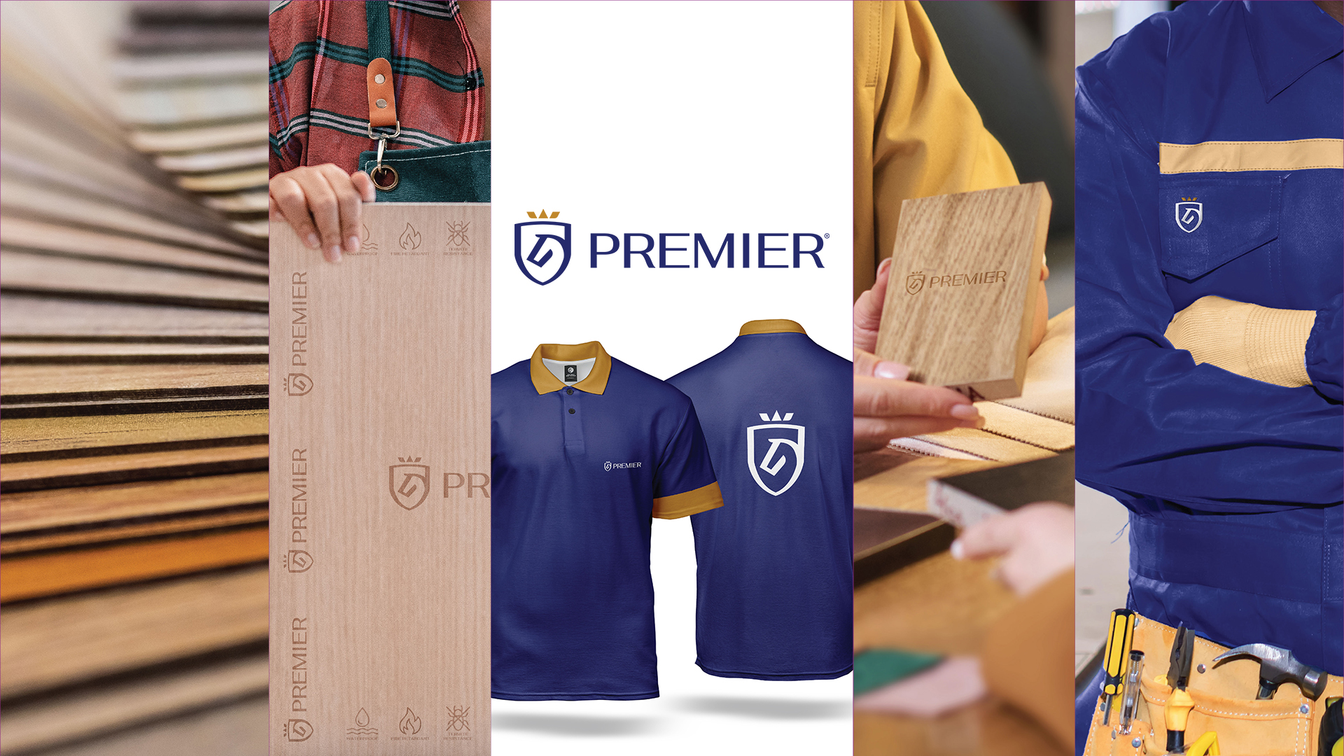
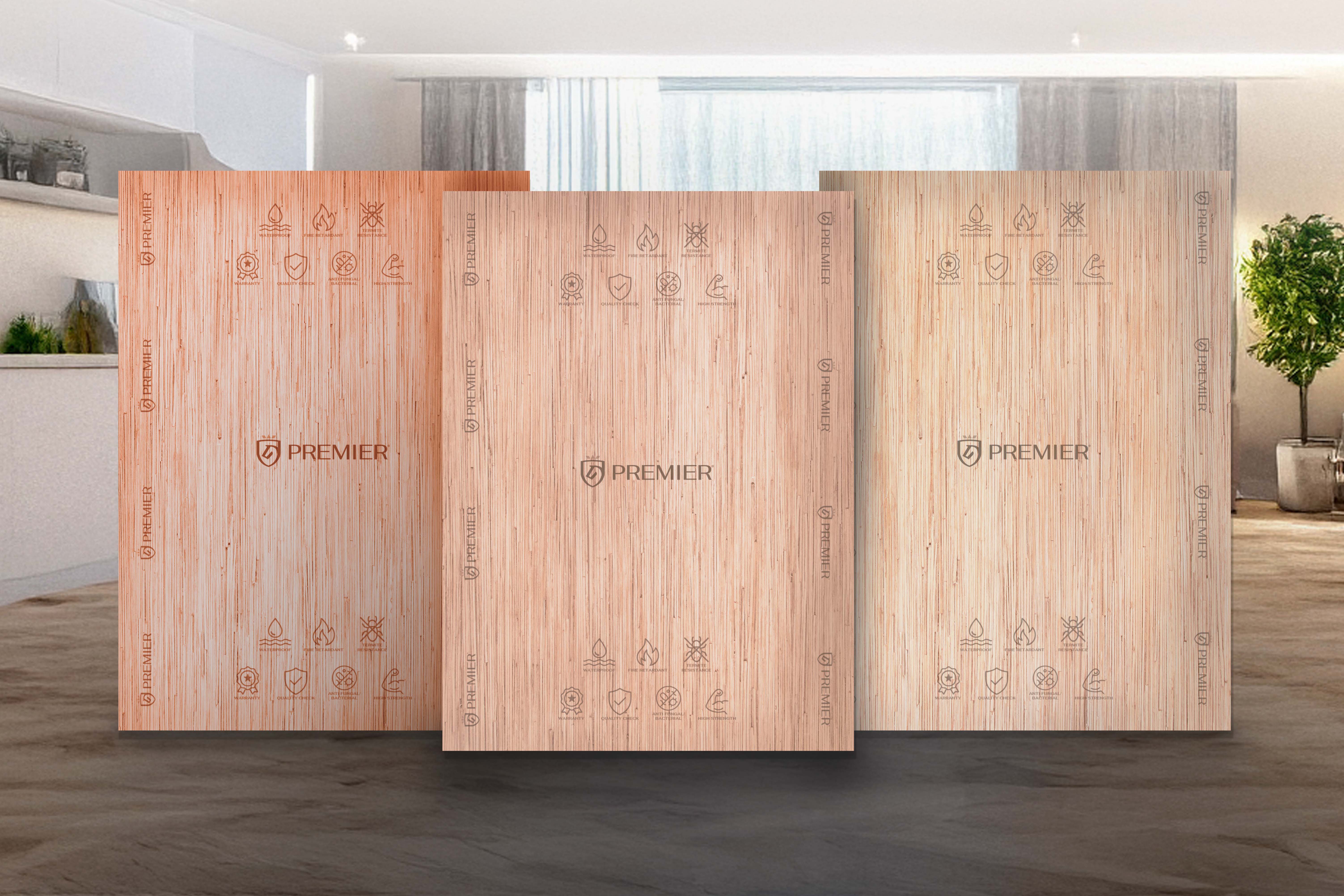
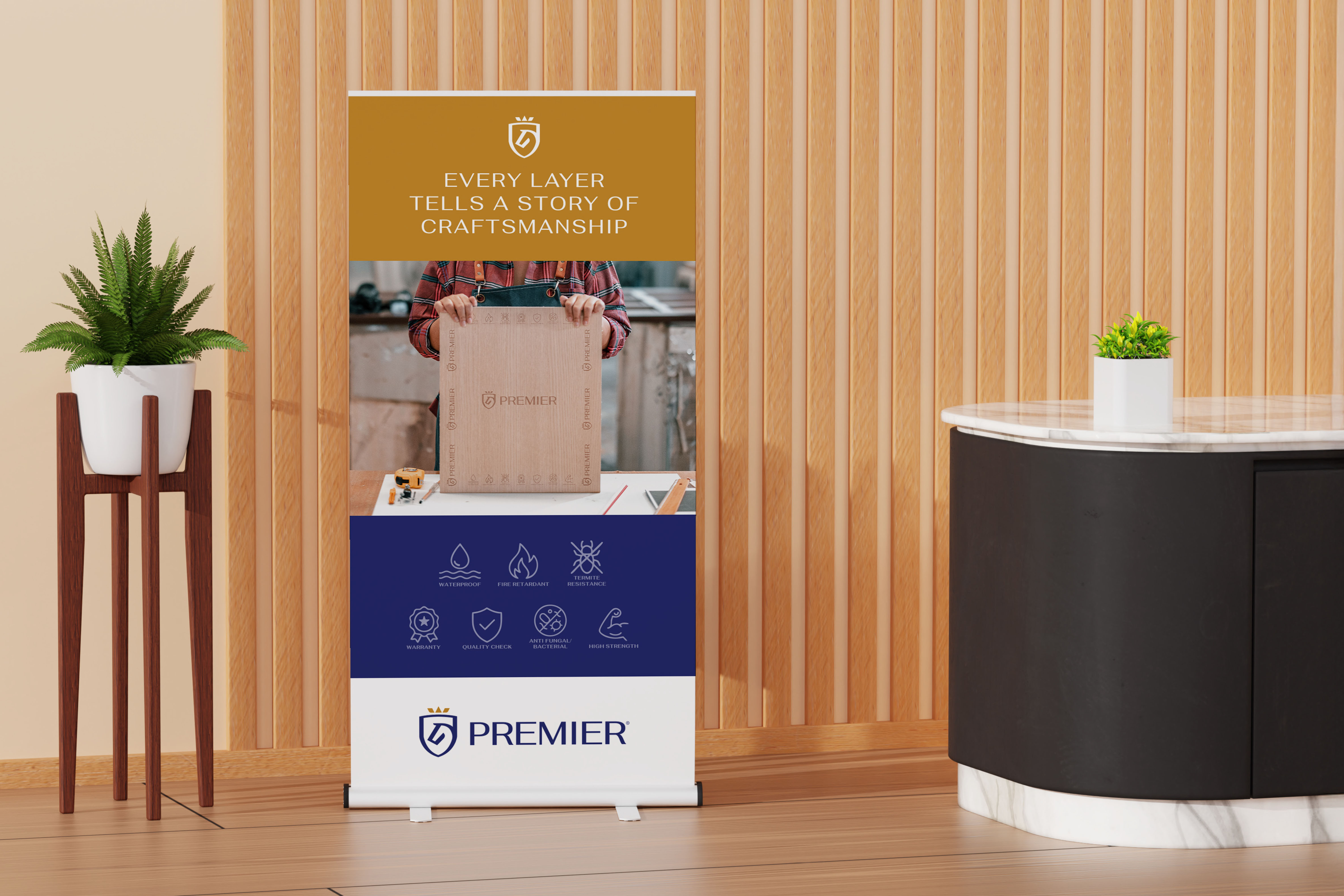
The identity was extended across all major touchpoints to ensure consistency:
- Stationery & business cards
- Employee uniforms & ID cards
- Brochures, catalogs, and packaging
- Website and social media templates
- Outdoor, banners, and exhibition assets
Each application reinforces Premier as a dependable, modern manufacturing brand.
This project wasn’t just about aesthetics; it was about building a usable system.
Premier now has:
- A clear brand rulebook
- A scalable identity framework
- Consistency across vendors, teams, and regions
The brand can grow without losing coherence; whether launching new products or entering new markets.
Premier emerged with a brand that finally matches its reality:
- Confident
- Trustworthy
- Future-ready
The new identity strengthens perception at every level; from factory floor to customer-facing touchpoints.
For dec6, this project demonstrates how strategy-led branding can transform not just how a brand looks; but how it’s perceived.