A Modern Take on a Canadian Classic
Design
SEO
ORM & Social Listening
How dec6 Reimagined Clearly Canadian’s Digital Experience; Honouring Its Legacy While Designing A Bold, Modern Platform Built For Today’s Consumers And Retailers.
A Modern Take on a Canadian Classic
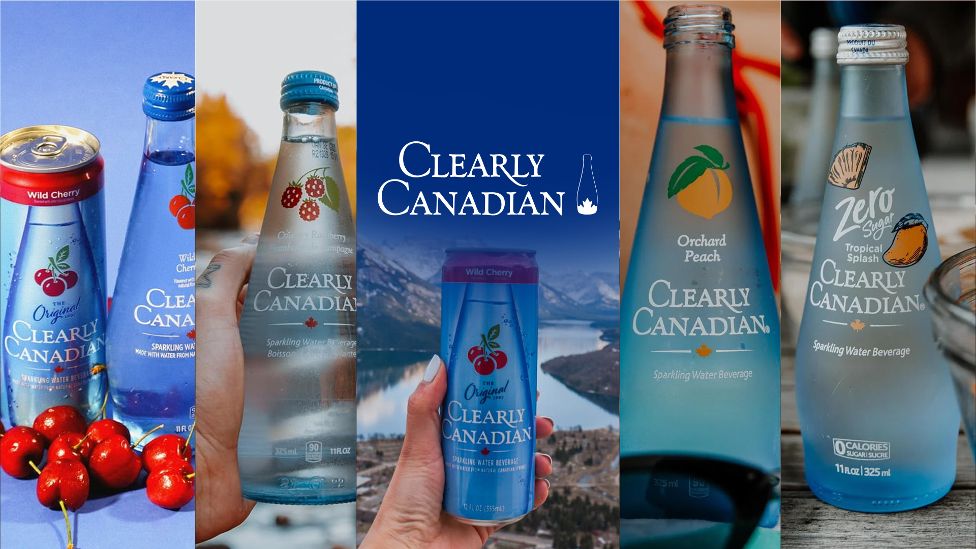
Clearly Canadian is more than a beverage; it’s a piece of Canadian nostalgia.
But while the brand had made a strong comeback, its digital experience didn’t fully reflect:
- The emotional legacy people associate with the brand
- The premium, refreshing nature of the product
- The depth of its story, values, and community initiatives
The website worked; but it didn’t spark.

This wasn’t about reinventing Clearly Canadian.
It was about amplifying what already made it special.
The website needed to:
- Feel as crisp as the product itself
- Balance nostalgia with modern design
- Tell the brand story visually, not just verbally
- Work seamlessly across product discovery, storytelling, and community content
In short: the experience had to feel refreshing.
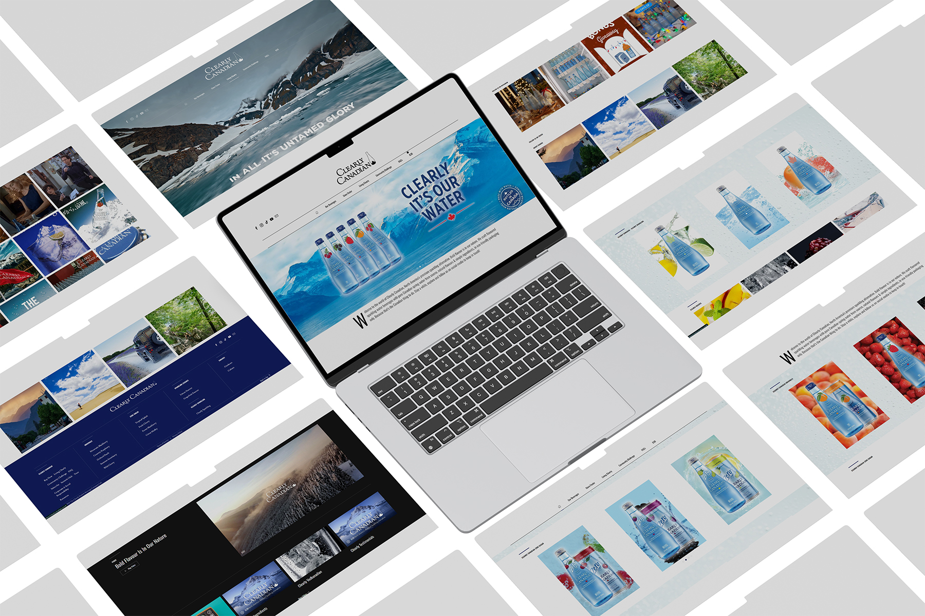
We approached this project like a brand editorial; carefully curated, visually rich, and emotionally grounded.
Our focus areas:
- Clean, breathable layouts
- Strong visual hierarchy
- Product-first storytelling
- Seamless navigation across content-heavy pages
- A design system that could scale with future launches
Every design decision was made to support clarity, calm, and confidence.
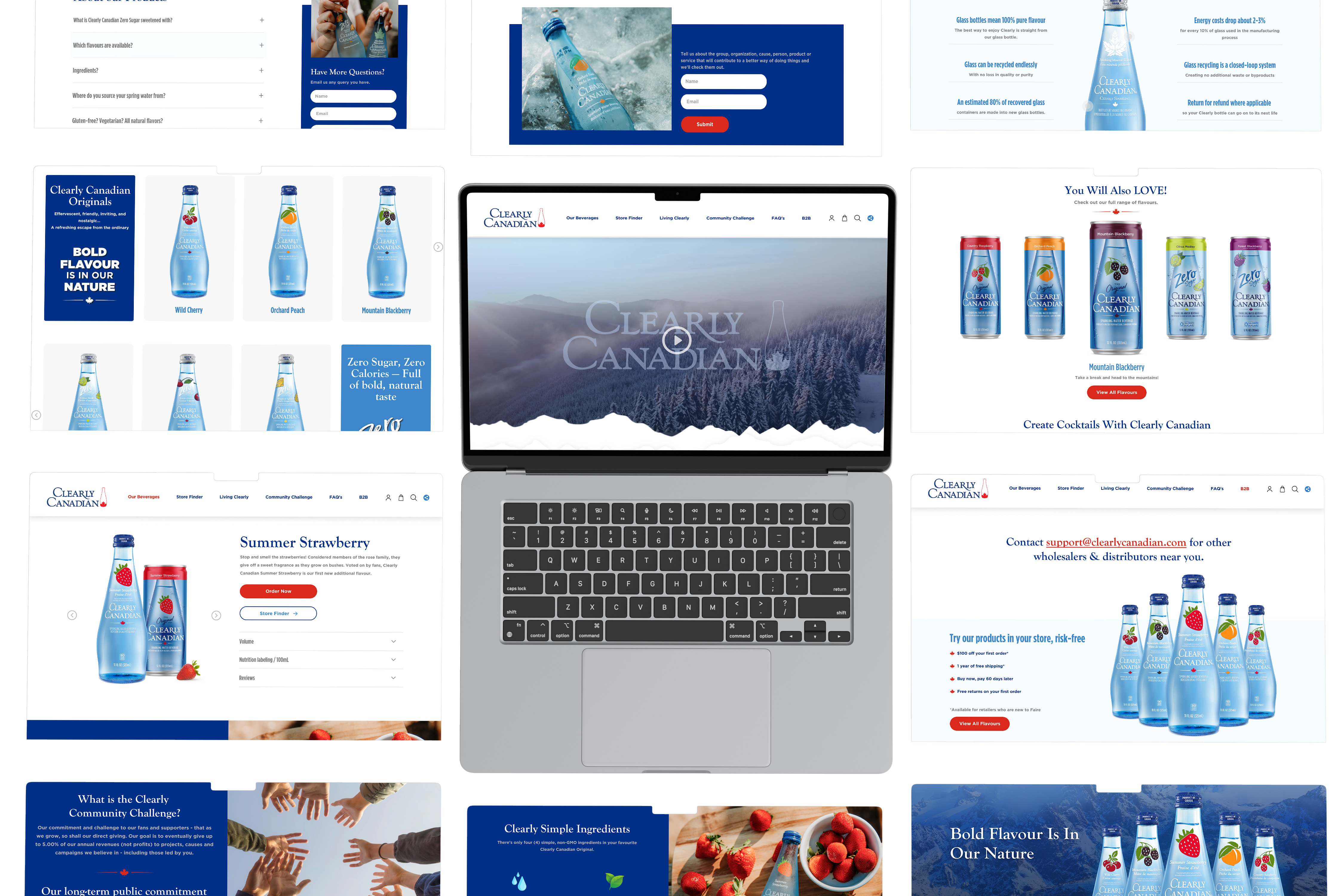
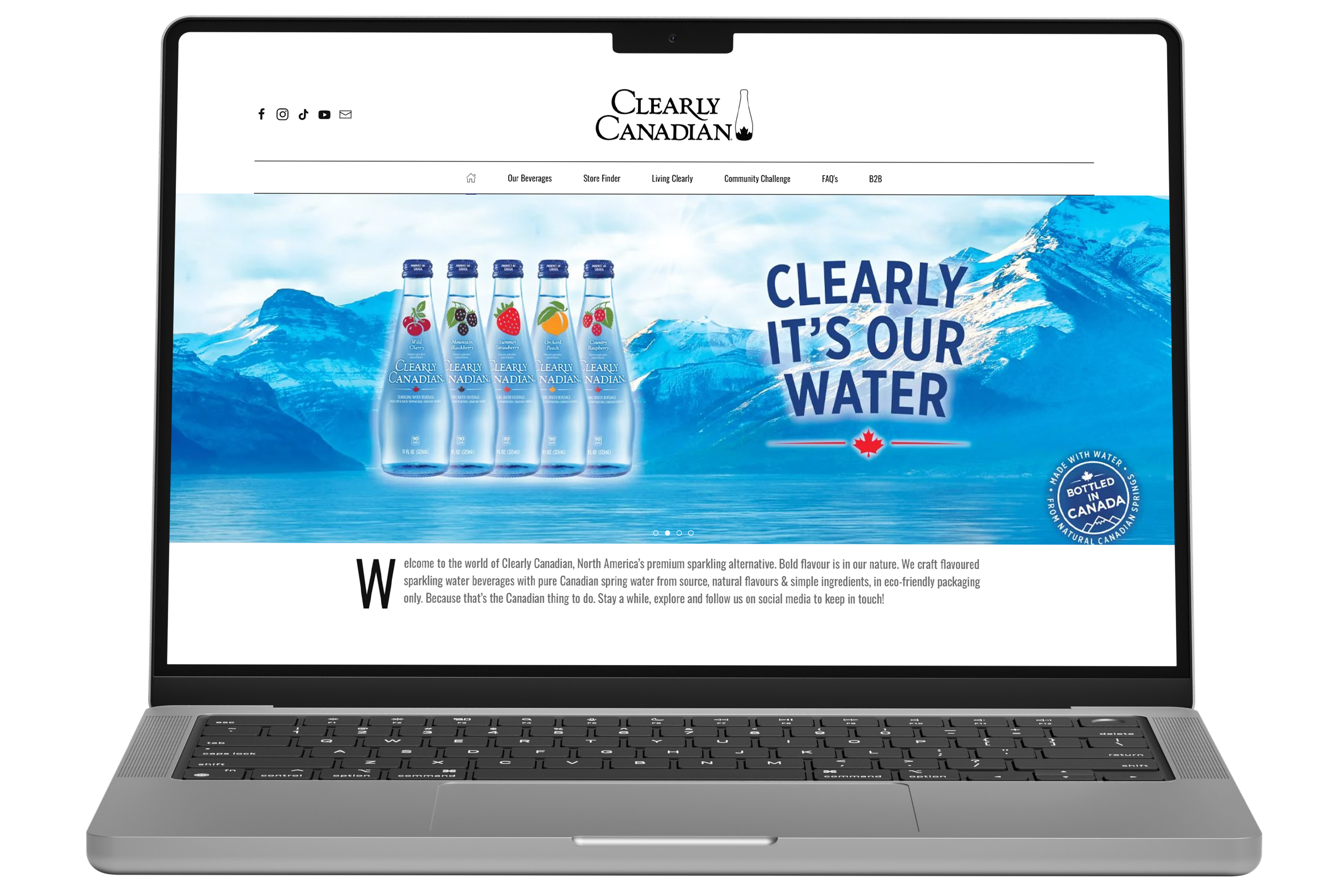
The refreshed website brings Clearly Canadian’s world to life.
Key improvements:
- A modernized homepage that blends brand story with product discovery
- Elevated product pages with strong visual focus
- Clear separation between Originals, Zero Sugar, and Sparkling Essence
- Immersive storytelling through sections like Living Clearly and Community Challenge
The result is a site that feels intentional, premium, and unmistakably Clearly Canadian.
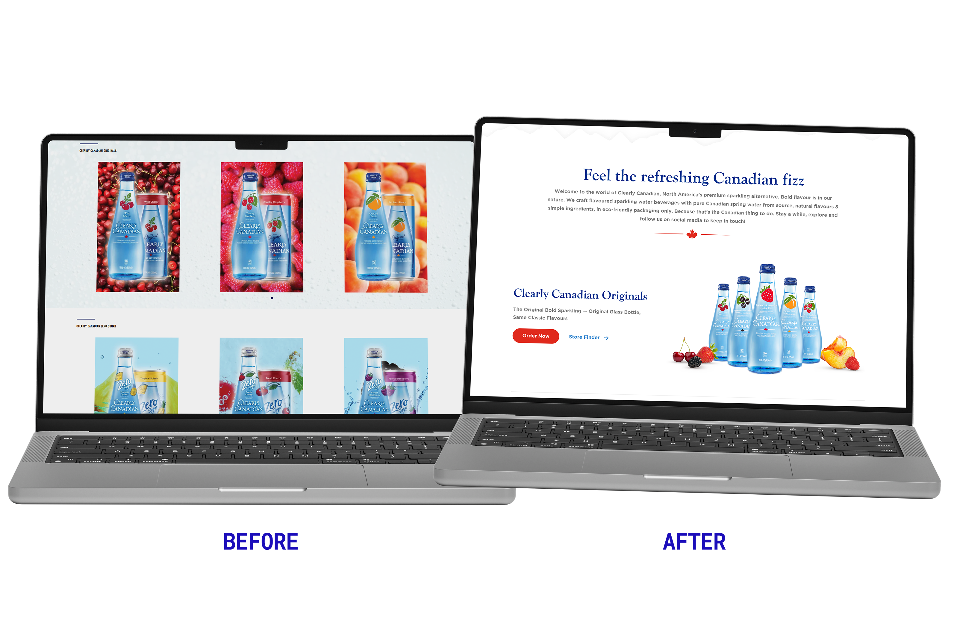
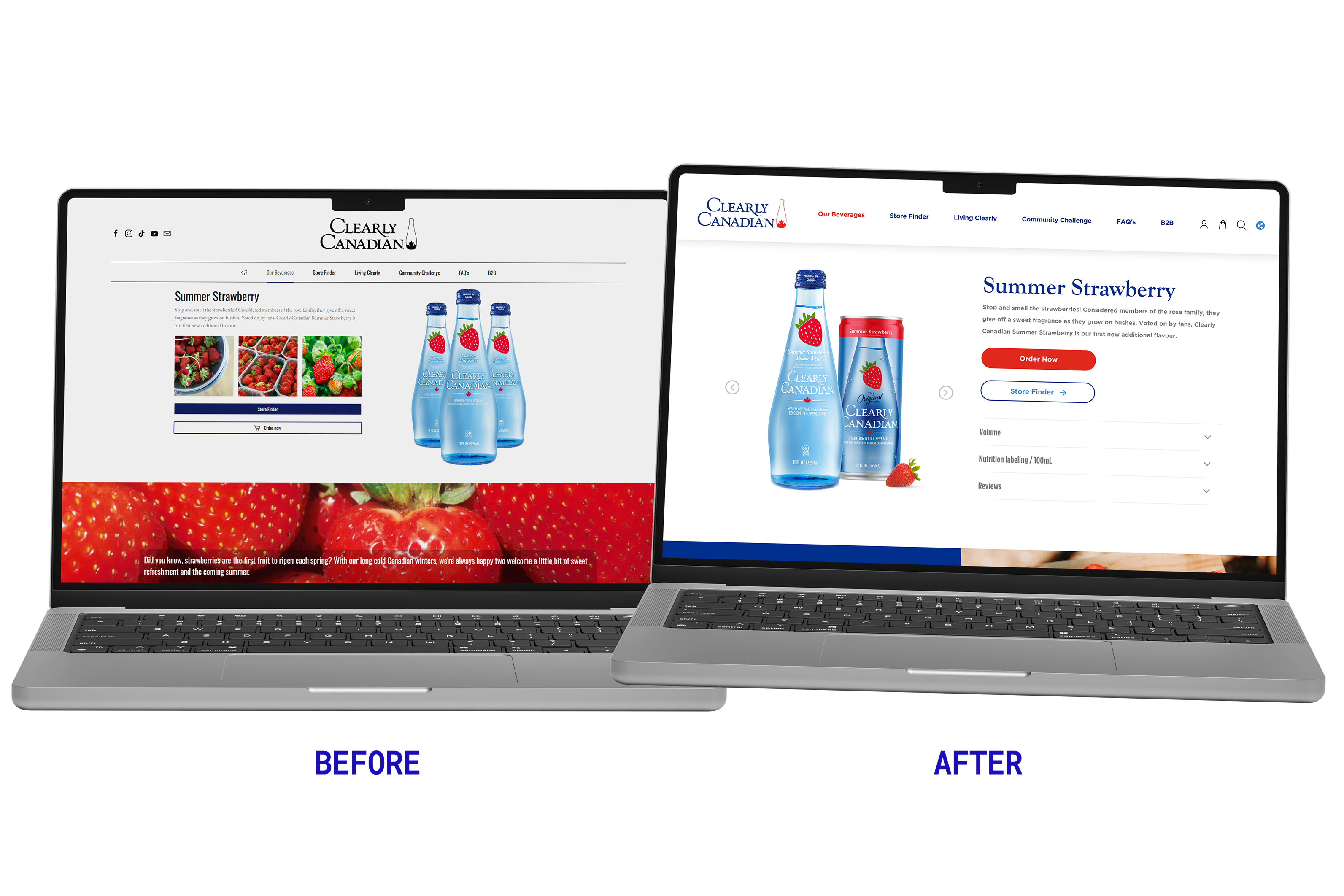
- Visually heavy sections
- Limited storytelling through layout
- Product pages focused more on information than experience
- Brand legacy under-represented
This version did the job; but didn’t fully express the brand’s personality.
- Light, airy layouts with breathing room
- Clear content flow and visual hierarchy
- Products showcased as hero elements
- Story, values, and community brought forward visually
The site now feels as refreshing as the drink itself.
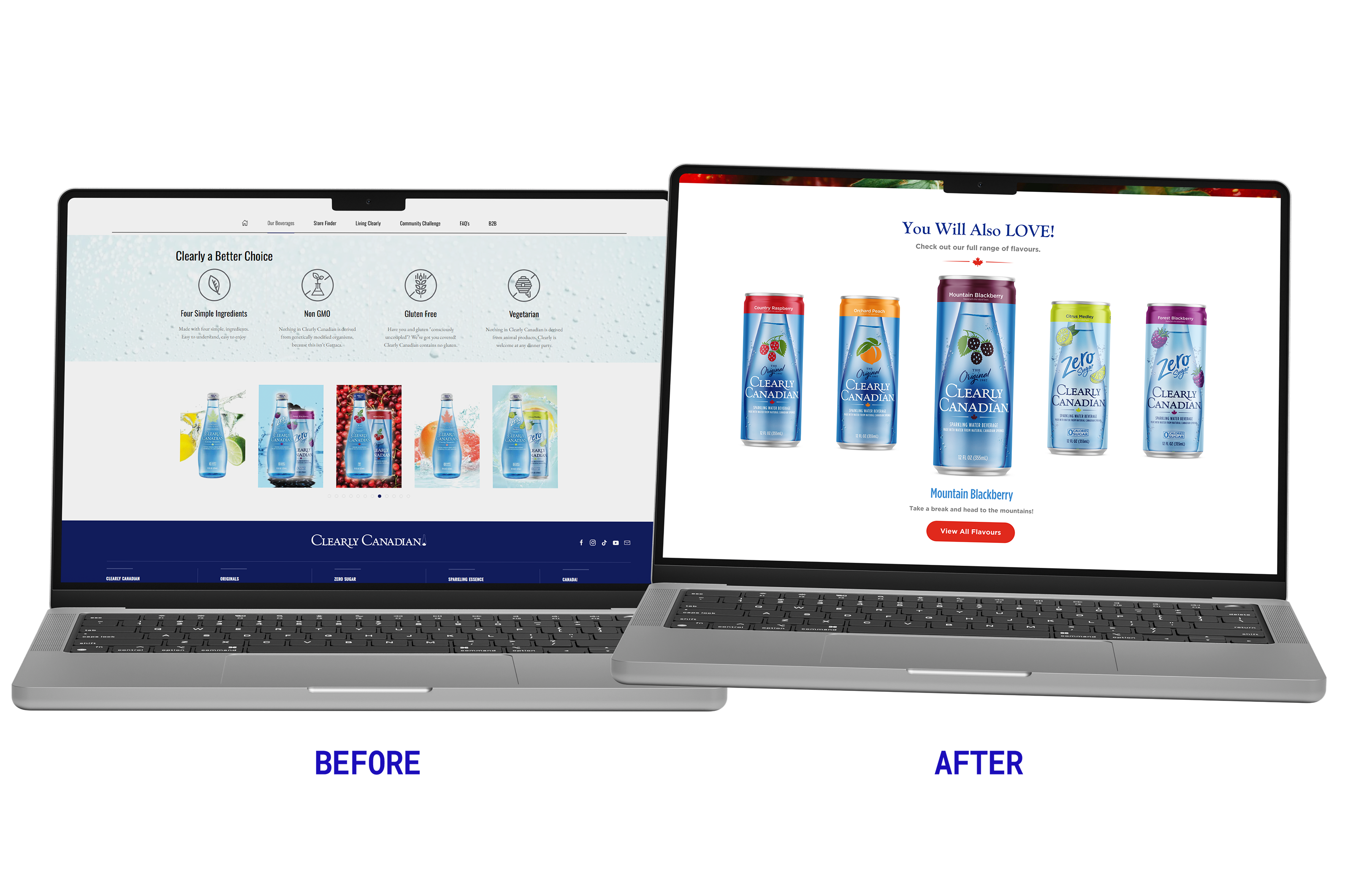
- Strong visual storytelling across every page
- Product-led design that drives exploration
- Seamless navigation across content, products, and community
- A flexible design system built for future growth
This wasn’t just a refresh; it was a re-expression of the brand.
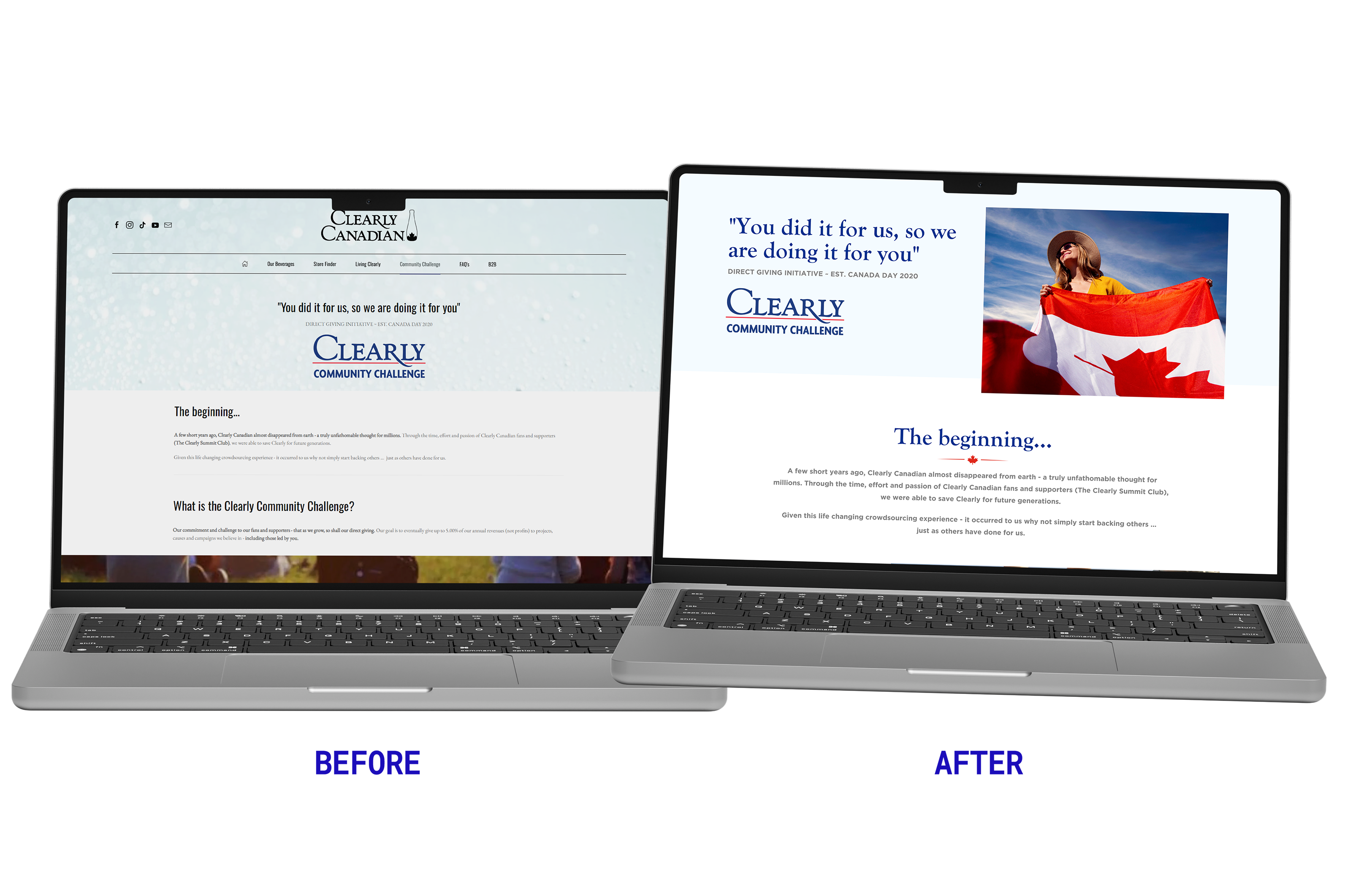
To Clearly Canadian, community isn’t a campaign; it’s a responsibility. The Clearly Community Challenge page was reimagined as a purpose-driven digital space that celebrates giving back, participation, and shared values.
We refined the content hierarchy and visual storytelling to ensure the initiative felt credible, human, and action-oriented. The result is a page that transforms brand loyalty into community involvement; reinforcing Clearly Canadian’s role as a brand that listens, contributes, and leads with intention.
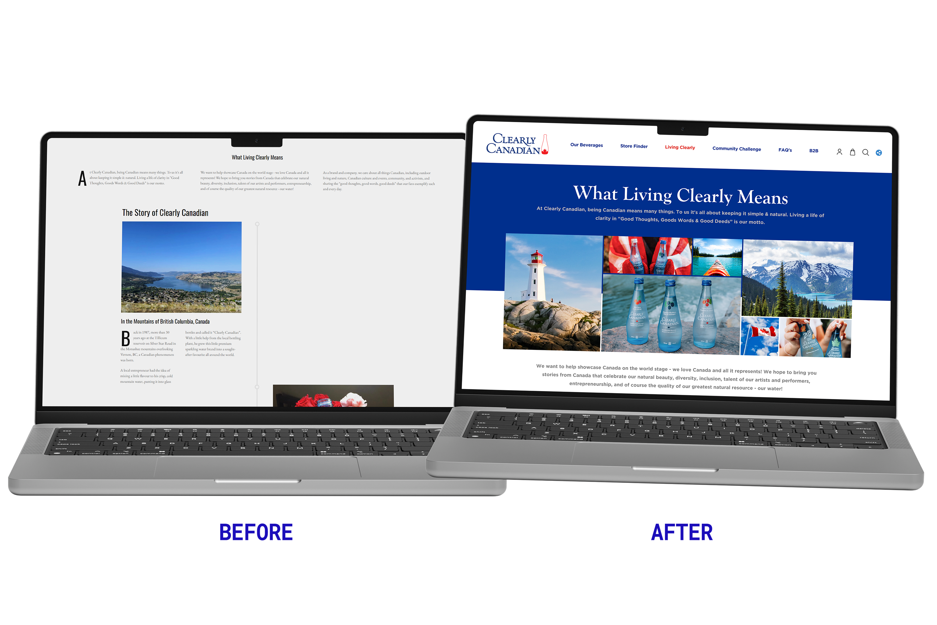
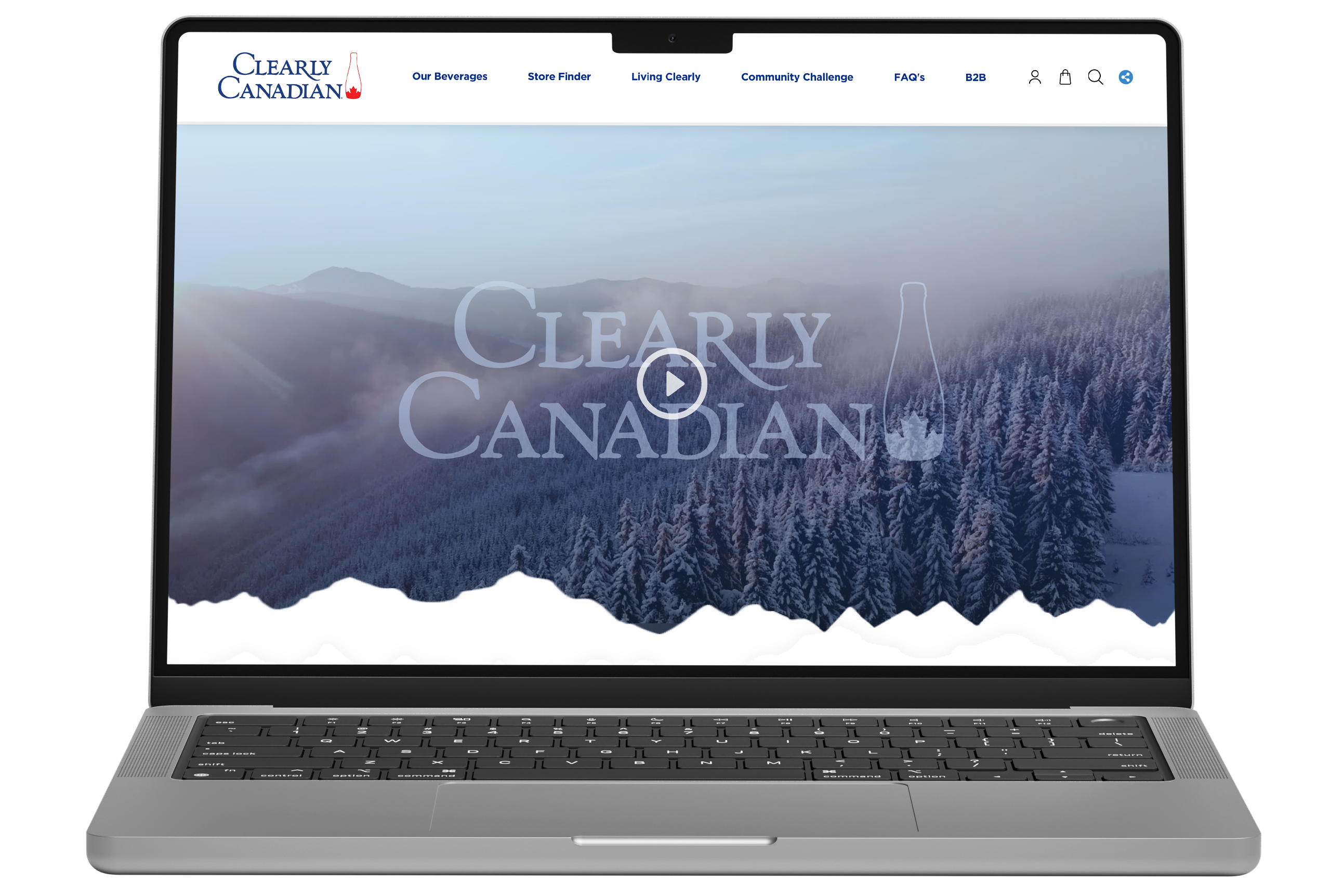
“Living Clearly” is more than a tagline; it’s the brand’s philosophy brought to life. This page was designed to articulate Clearly Canadian’s values through immersive visuals, editorial layouts, and thoughtful pacing.
By blending storytelling with structure, we created a narrative experience that deepens emotional connection while improving discoverability and engagement. The page acts as a brand manifesto; clearly defining what the brand stands for, how it shows up in the world, and why clarity still matters.
Clearly Canadian now has a digital experience that reflects who they are; and where they’re headed.
What changed:
- A modern, premium online presence
- Clear alignment between product, story, and values
- A website designed to grow with the brand
- A platform that feels welcoming, confident, and distinctly Canadian
This refresh ensures the brand’s story continues; clearly, confidently, and beautifully.